TurnTableLabs Rebranding
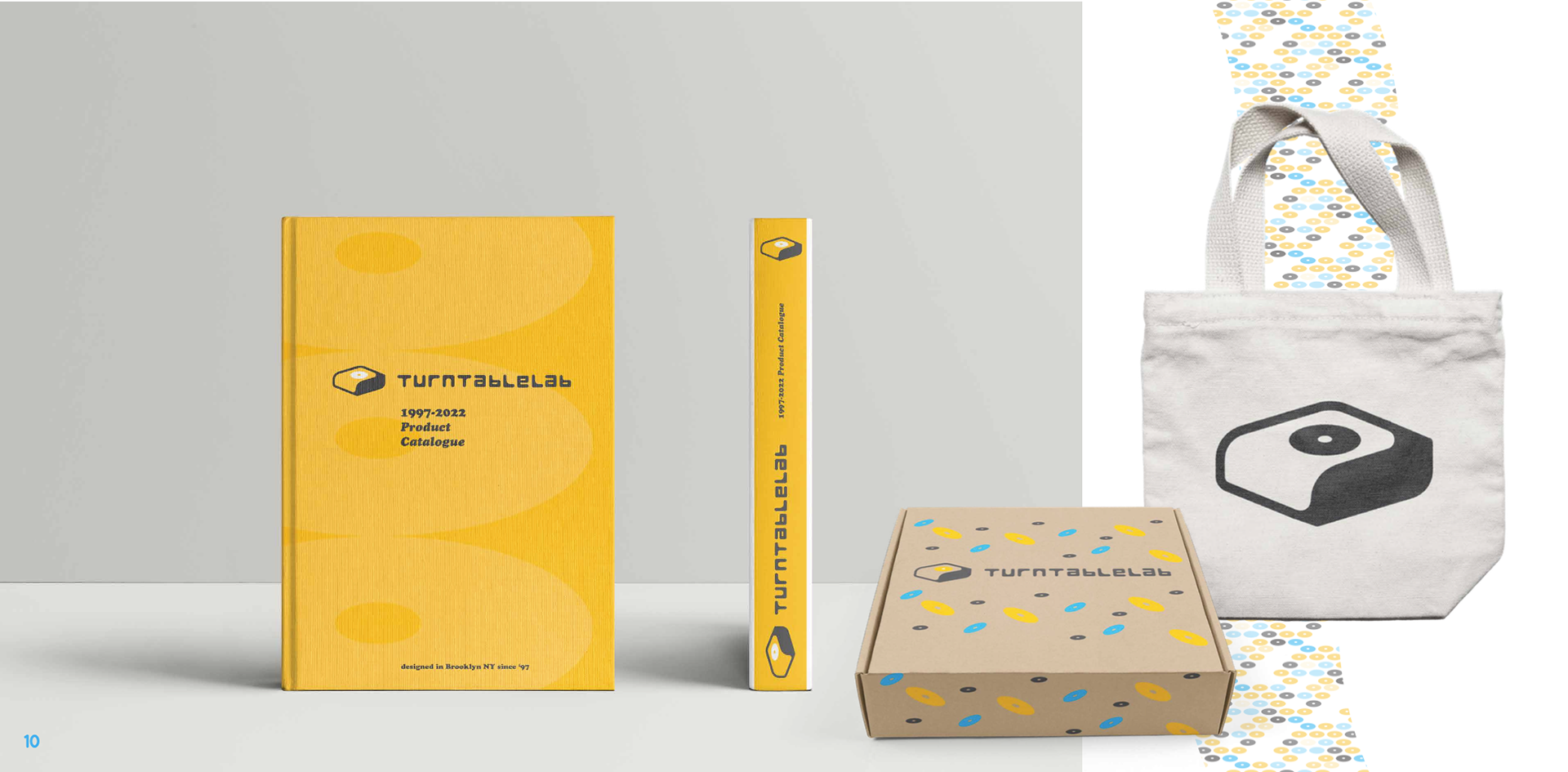
TurnTableLabs has been an industry leading supplier of both professional and amateur audio equipment since 1999. In the last five years they have started producing their own vinyl editions for artists, the goal of this rebranding is to advertise their new products and services.
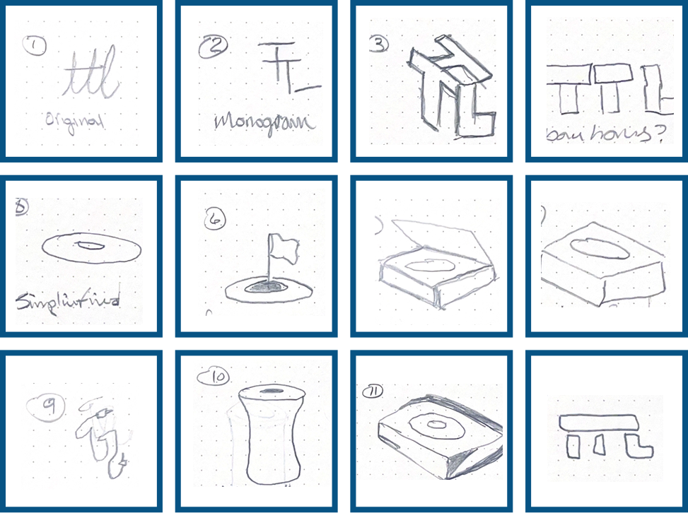
SKETCHES
These sketches represent the early path for this project. Many audio equipment companies have very minimal logos due to the small sizes they are printed at, so legibility is the ultimate focus.
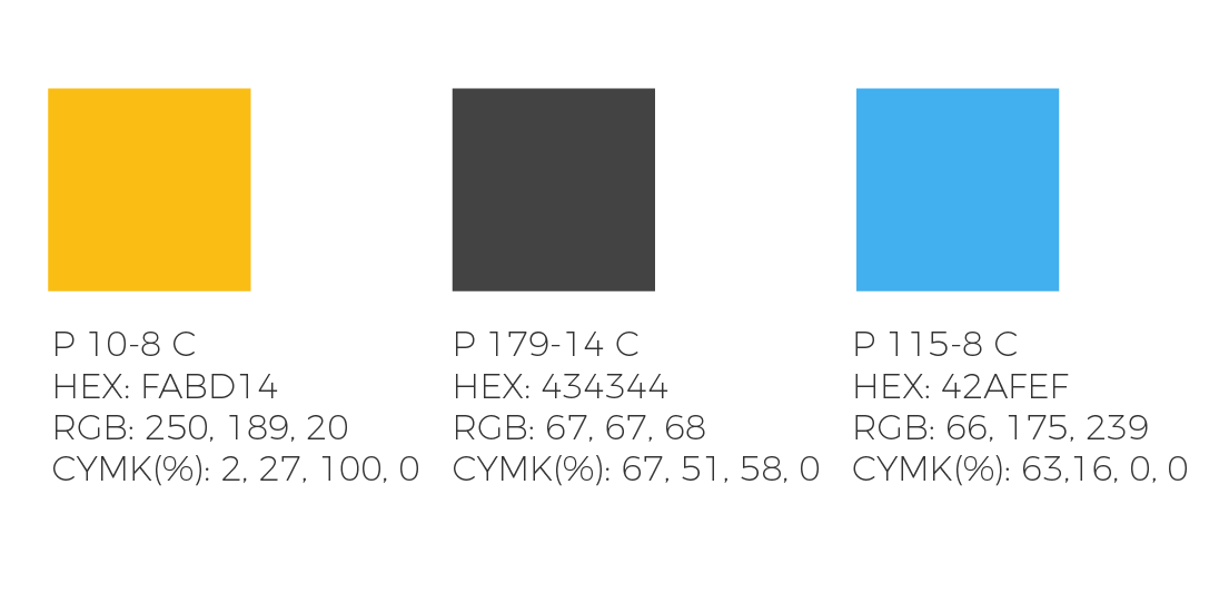
COLOR
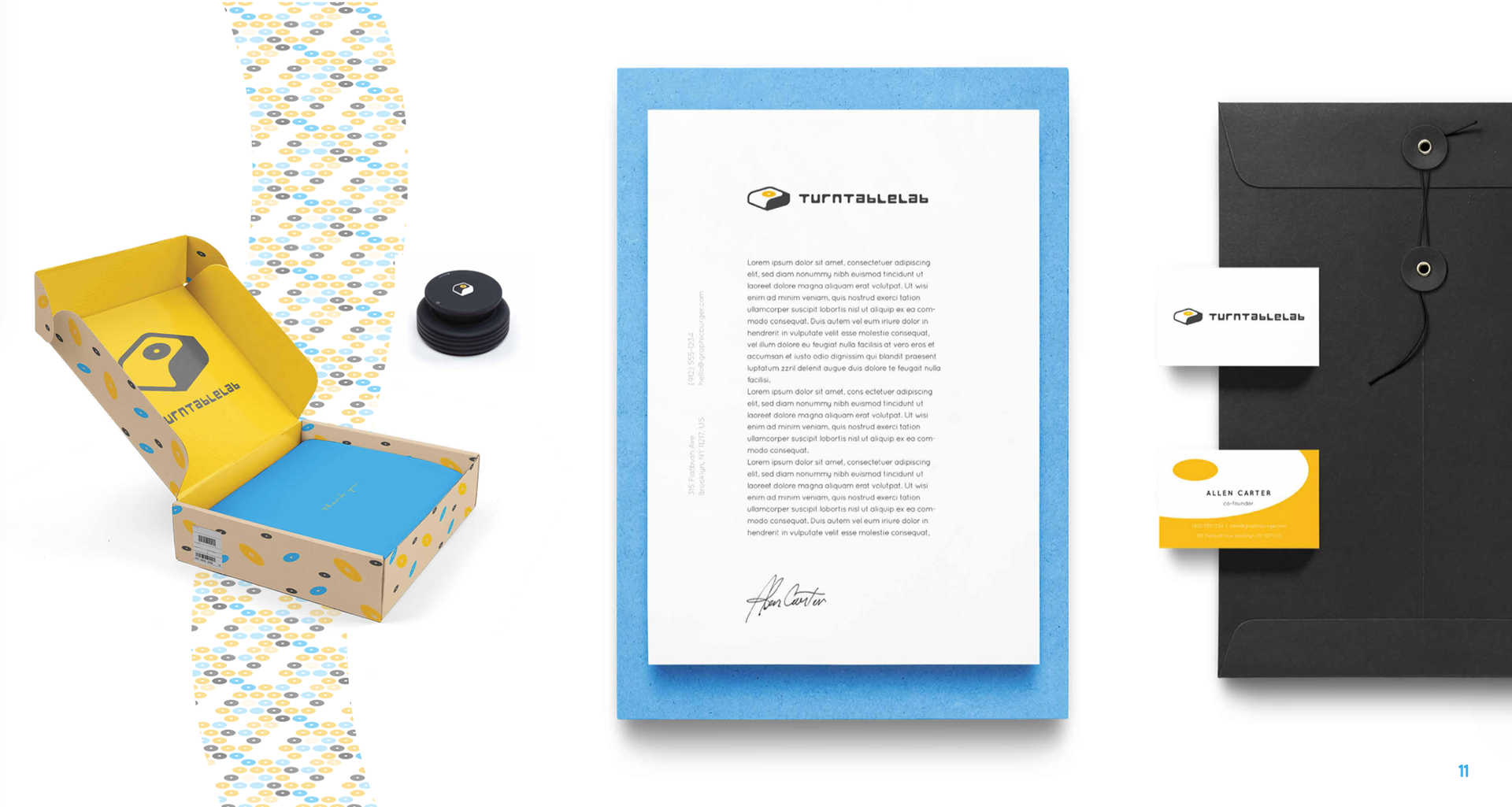
These colors are meant to be simple, most of their products are monotone, black or white logo, and the two complementary colors will help with branding and stationery
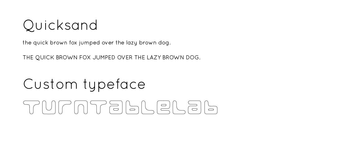
TYPOGRAPHY
Type is always key with a good brand identity. I wanted something similar to what they already have, just a refreshed version to continue the trend for this project. Since I designed a custom logotype for the main logo, something simple and effective here was very important.
DIGITAL SKETCHES
These three logos made it from my initial sketches, I felt the bottom two lacked the contextual imagery to associate them with a audio company. The top turntable has a unique 3D cell-shaded effect that is common for other audio companies, like Kanto Audio.
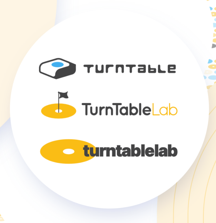
FINAL DESIGN
This final logo leans on the best of both worlds from my sketches, adding the small record to the center made it have more context visually. The custom logotype matches the bezels of the icon, creating some design harmony.

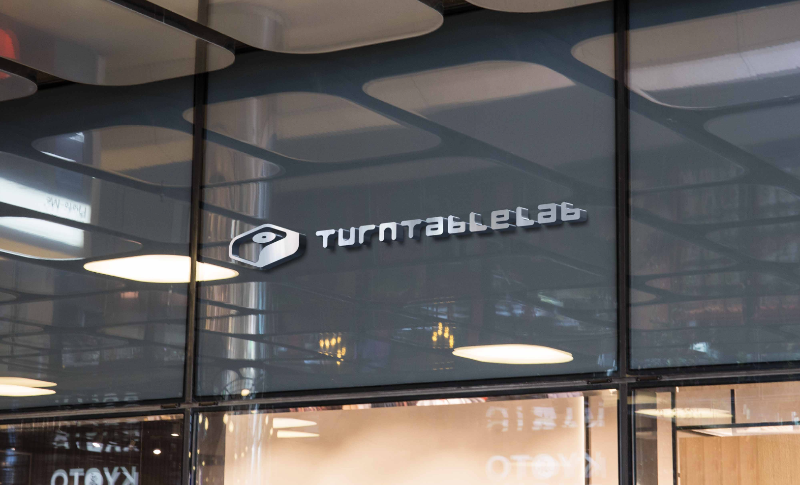
ENVIRONMENTAL CONTACT