
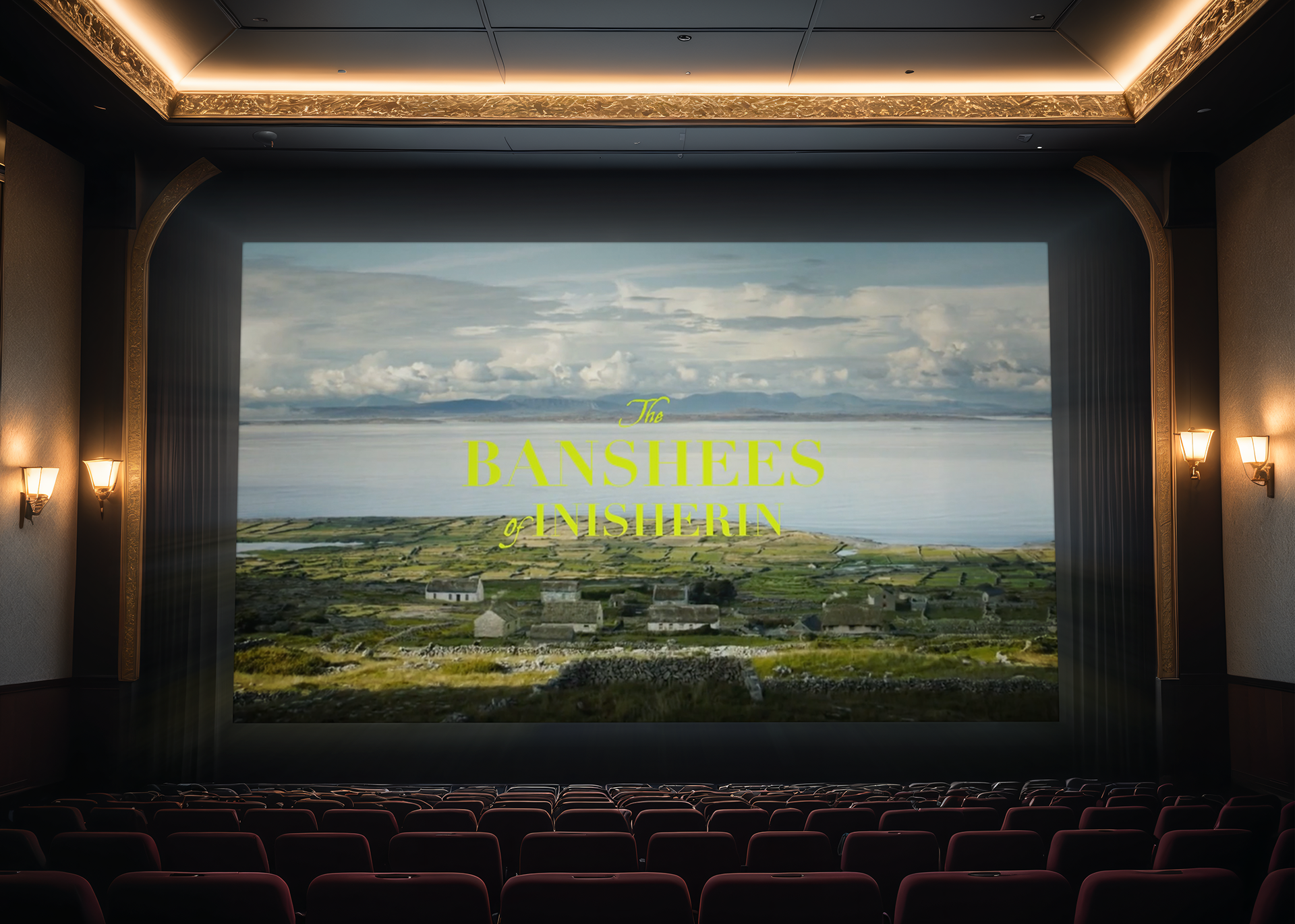
Fictional Movie Title Slate
Based on the film The Banshees of Inisherin, we were tasked to create a movie title slate for a film that either did not have one, or needed improvement, in this case the original director did not create one.
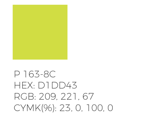
COLOR
This choice of acid green was a bold one, however it compliments the natural scenery without distracting from it. A darker tone would blend in with its surroundings, and this color is rare to see in natural settings, which gives it a somewhat permanent feel.
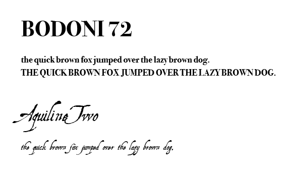
TYPOGRAPHY
These typefaces compliment the original design from the posters, with more of a script font that enforces the subwords. Bodoni is one of the few serif typefaces that had a balanced x-height, this symmetry aids in the design harmony of the overall piece.
STORYBOARD PROCESS
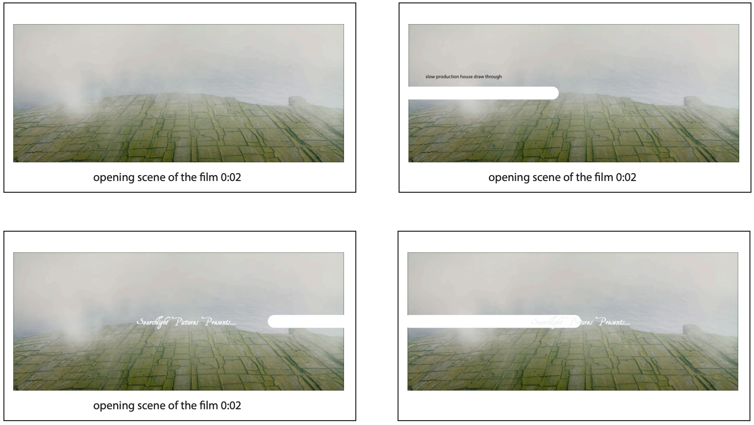
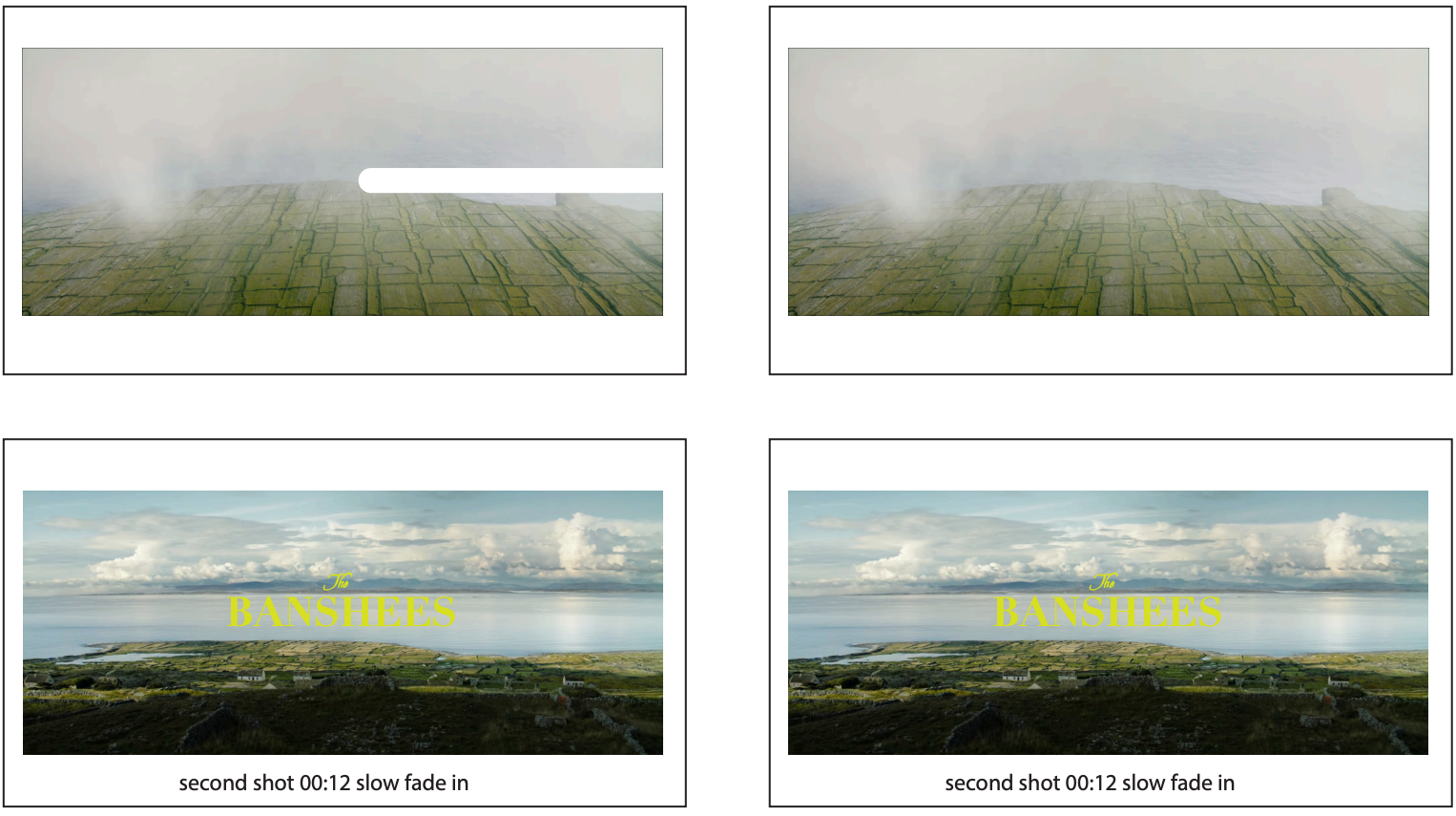
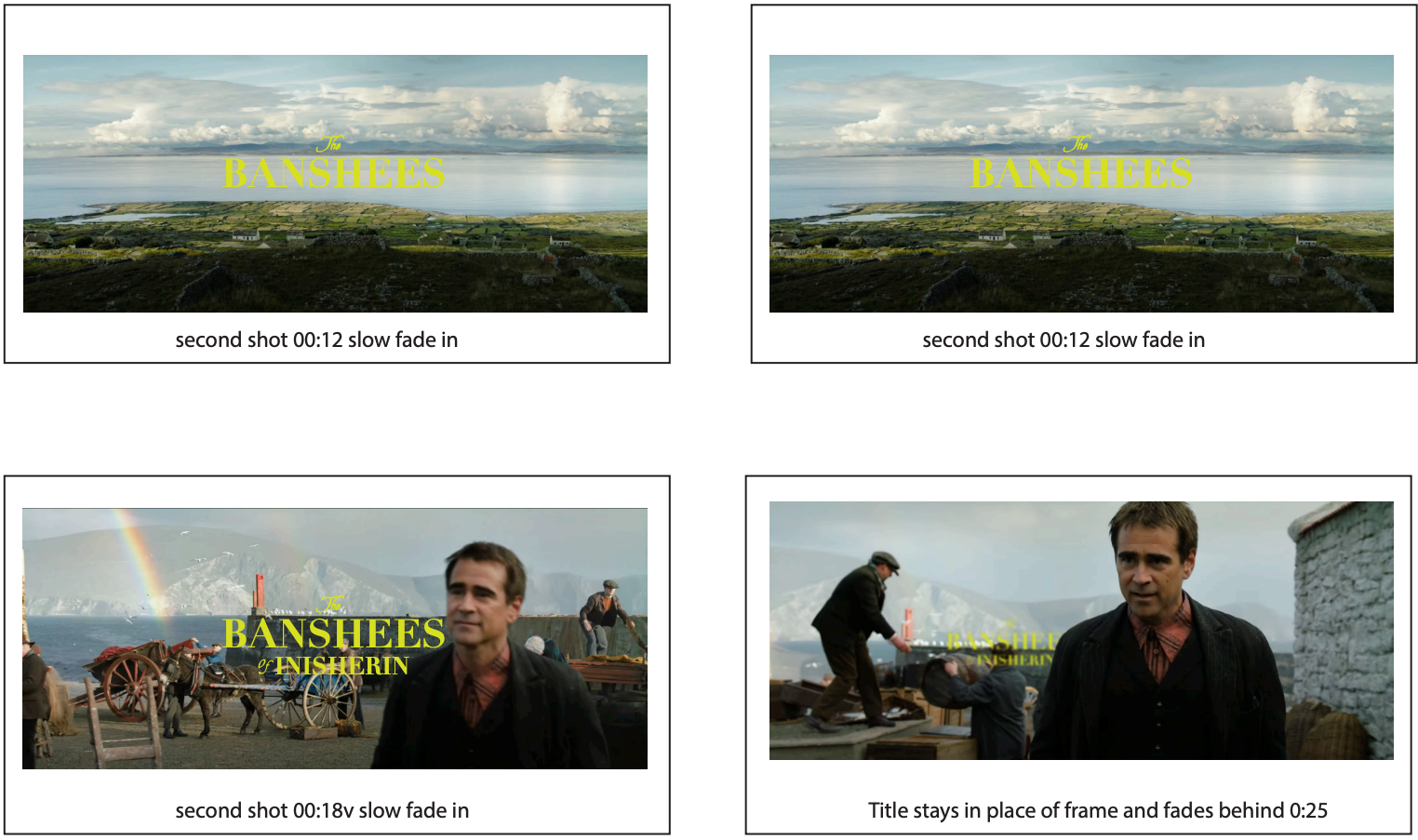
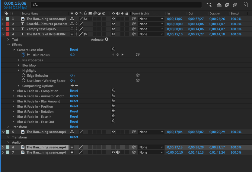
This initial work in Photoshop planned out my direction for the remainder of the motion design. The "white streak" for the intro was considered distracting, so I am glad I made these before getting started. After that, it was suggested to introduce the entire title in one shot rather than two.
The first thirty seconds of the movie was used, and I took some liberties to improve the logotype for the title. The full process of the vanishing effect are detailed below.
EDITING PROCESS
Adjusting each of these settings enabled the tracking for the text, simple camera lens blurs, in combination with a blurring map and fade in's. While subject tracking is common in motion design, using my storyboards, there was another "vanishing" effect I had to design on my own for it to completely disappear behind the subject.
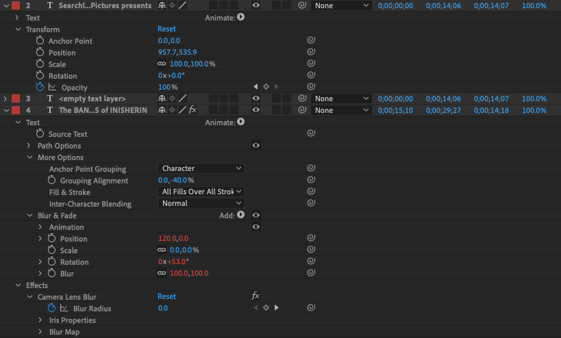
The more fine mechanics happened in nested layers, I've separated each type layer to track to each specific scene. This was something I overlooked in my storyboards which really lock in the effect.
FINAL MOTION DESIGN