Personal Branding Project
Displaying full Brand Identity process, from sketches, to digital sketches, final designs and type, and environmental placement.
PROCESS WORK
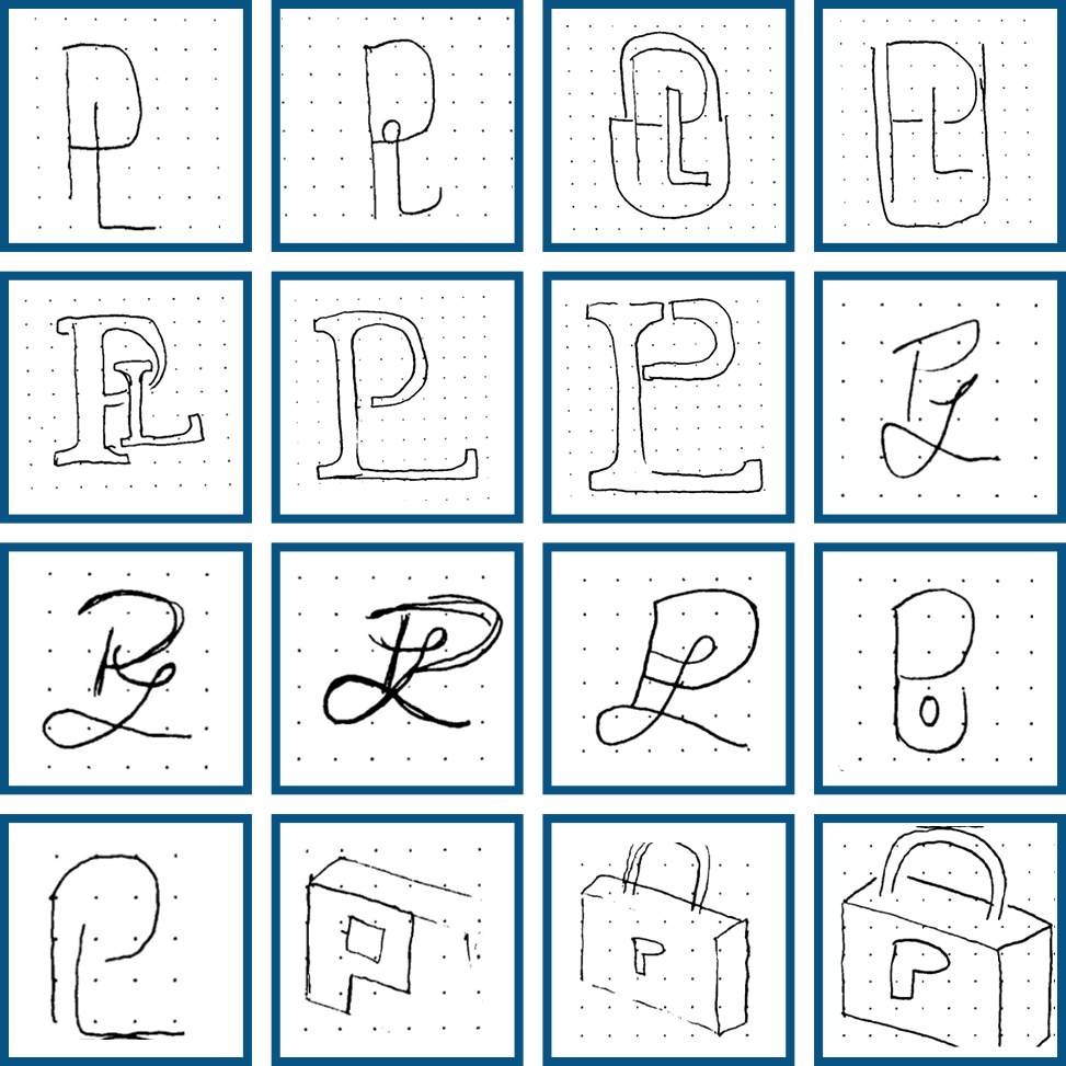
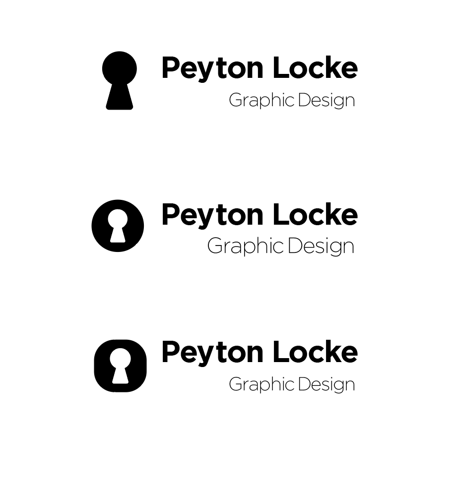
Initial sketches show my first dozen concepts for my logo, the idea of the keyhole is there, yet my initials were too complicated to create a hyper legible monogram at small scales.
COLOR CHOICE
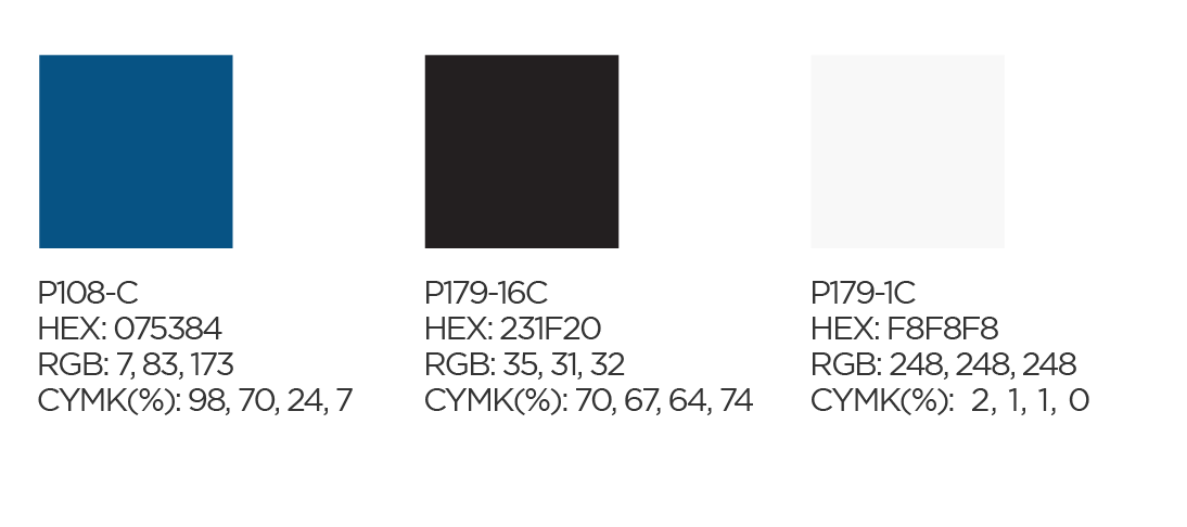
These colors represent my personal style, earth tone, monotone, and of course, some near-black. The blue is the same as my national heritage color from Scotland
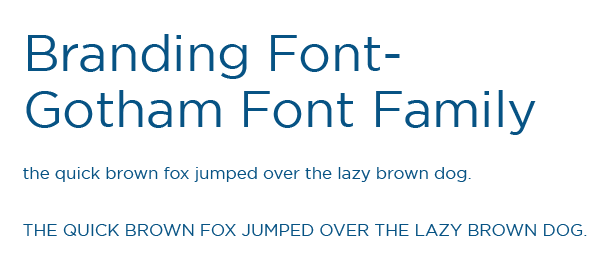
TYPOGRAPHY
Initially I went with a sans-serif paragraph font, but mixing the two styles of fonts was jarring, and Gotham is recognizable and represents ubiquitous design principles.
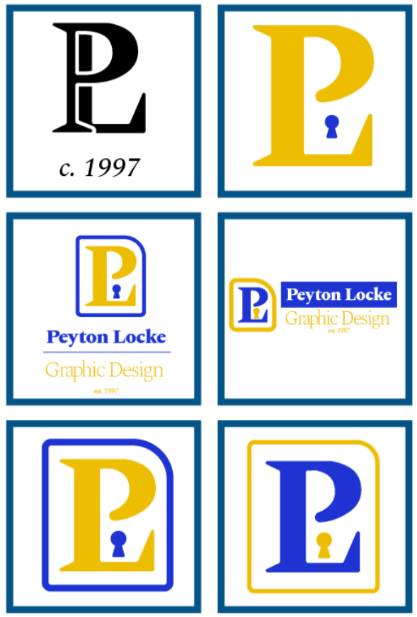
DIGITAL SKETCHES
Here I started properly experimenting with monograms and icon, and early stage of colors. The issues are pretty obvious, they either combine two ideas into one, or do not scale down to size well. The monogram feels too business oriented, almost seems like a lawyer's branding or bank logo. Little did I know the solution was right in front of me.
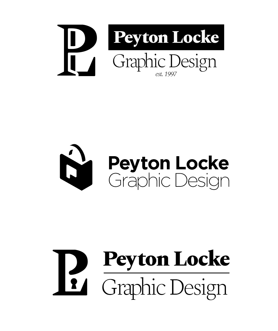
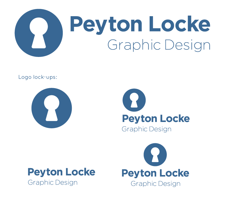
FINAL DESIGNS
While I designed my final logo, color and typography were next. I wanted a sans-serif logotype since my logo is round and I didn't want it to clash with my icon. Gotham is a timeless classic and it's my first time using it in a final project. The logo lock-ups provide alternative layouts if there are further complications or design restraints.
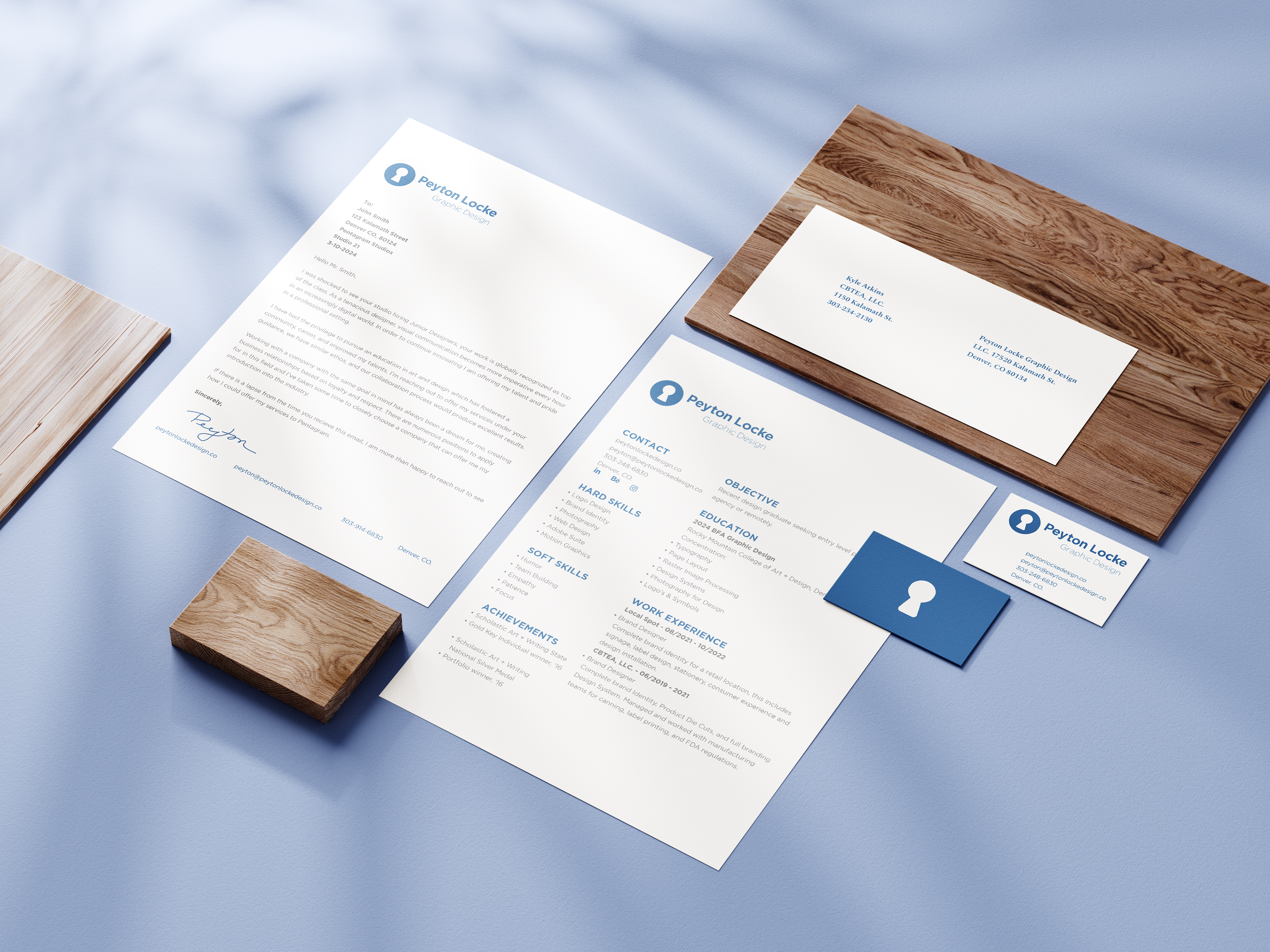
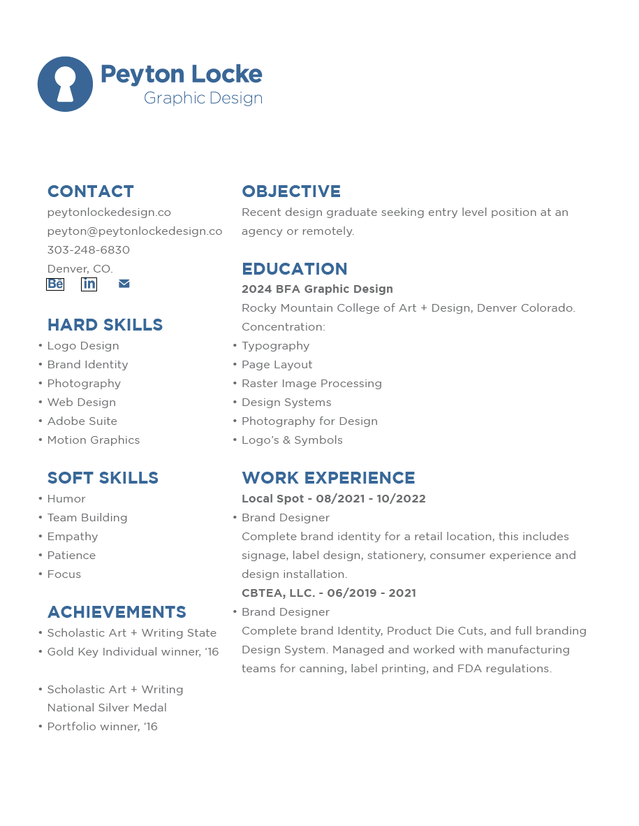
STATIONERY

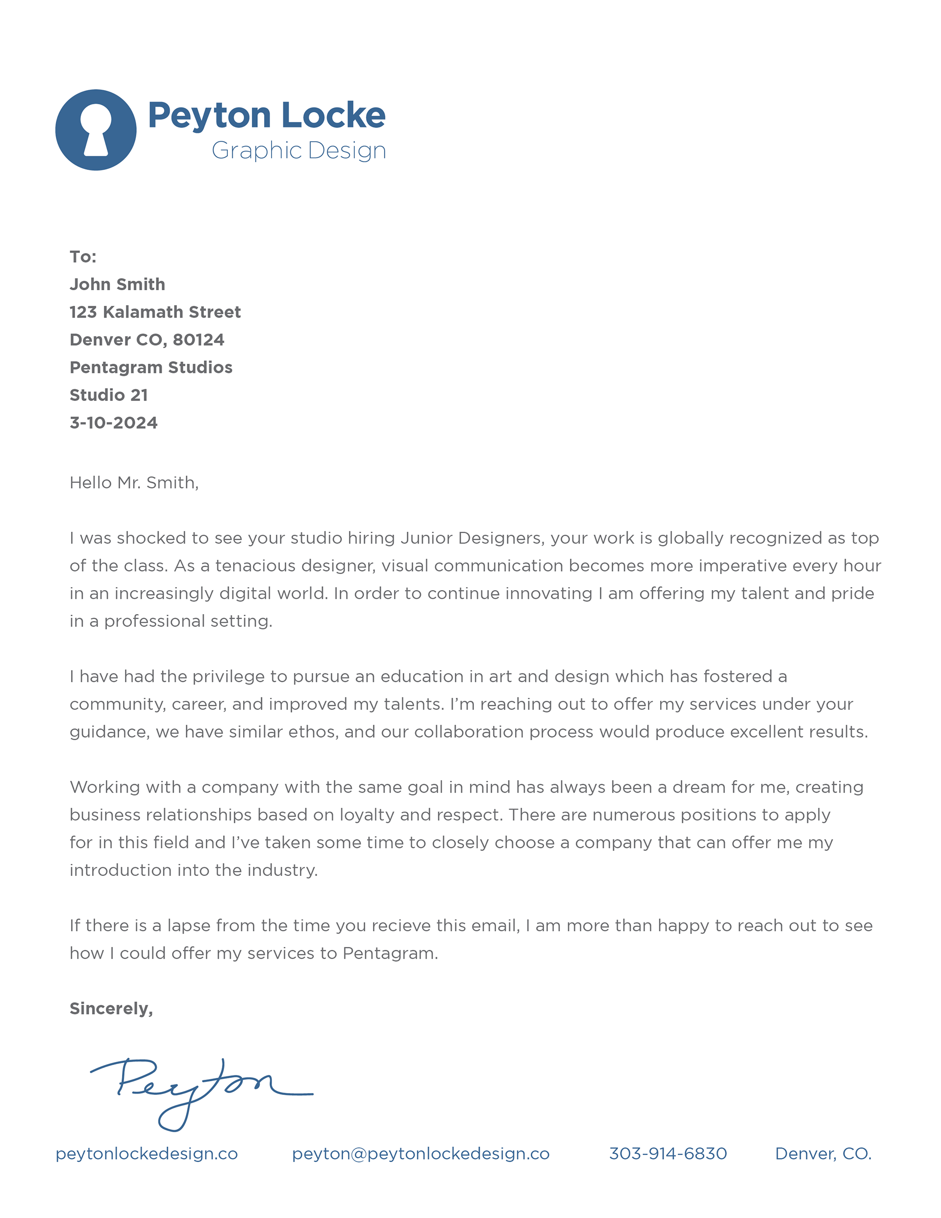
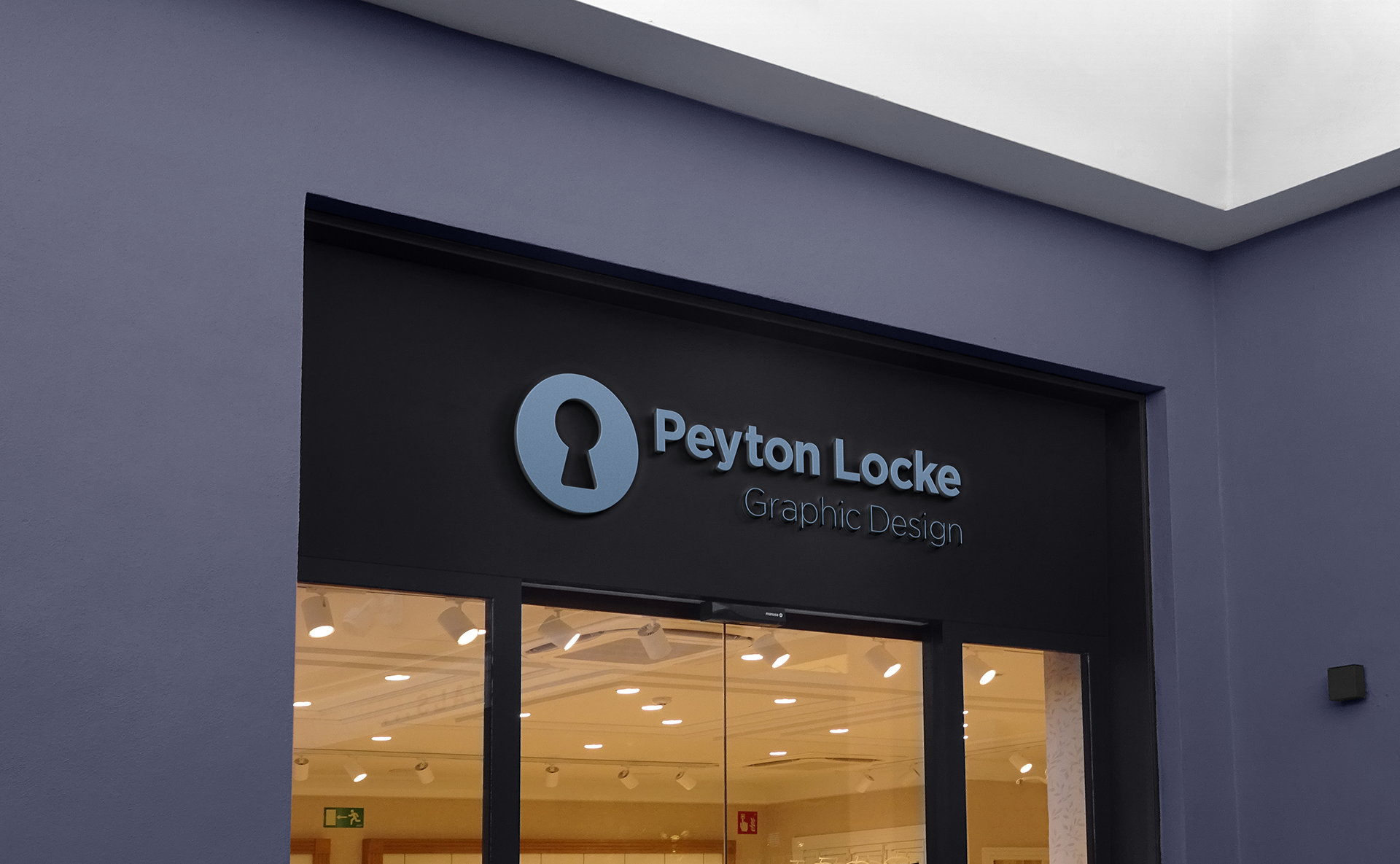
ENVIRONMENTAL CONTACT