Olympics Branding Project
Branding the 2020 Winter Olympics in Rekyjavik, Iceland, a first for their nation. It was important to honor nordic culture while appealing to a global audience.
Sketches
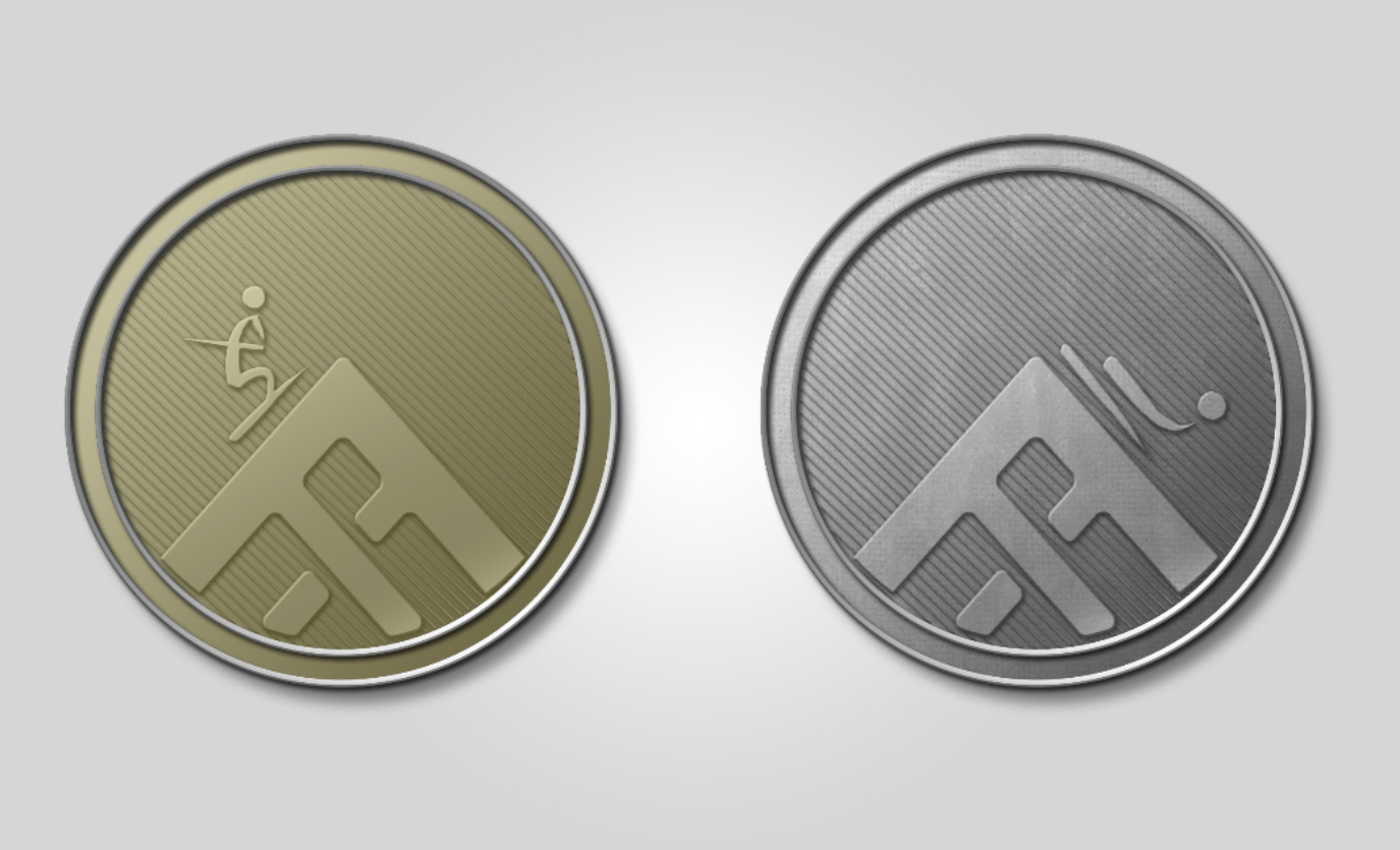
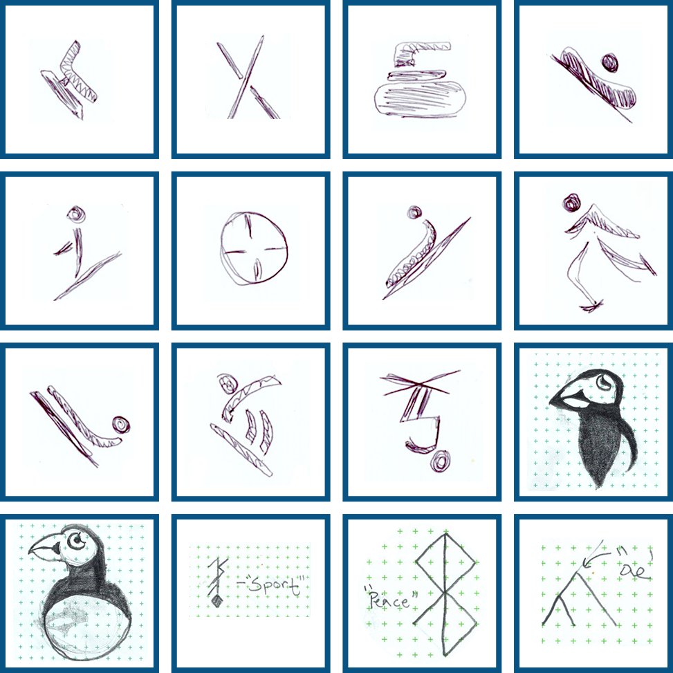
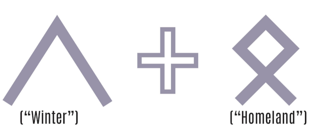
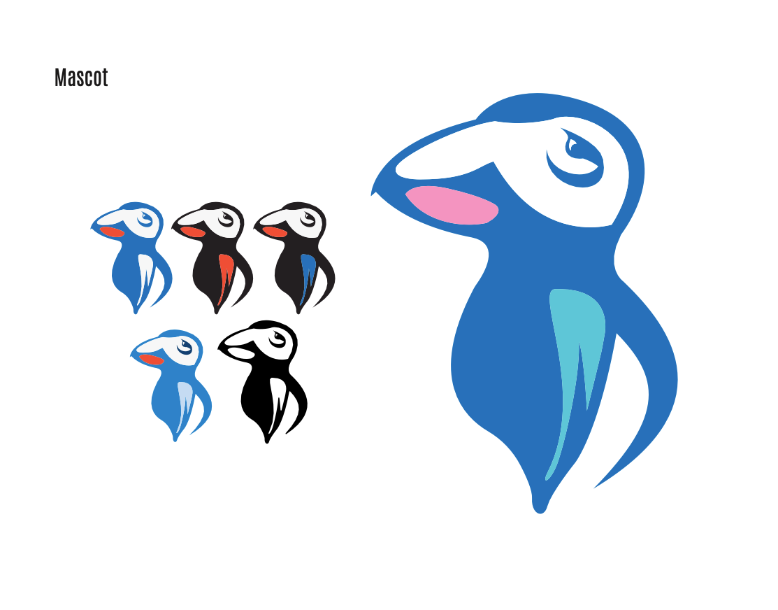
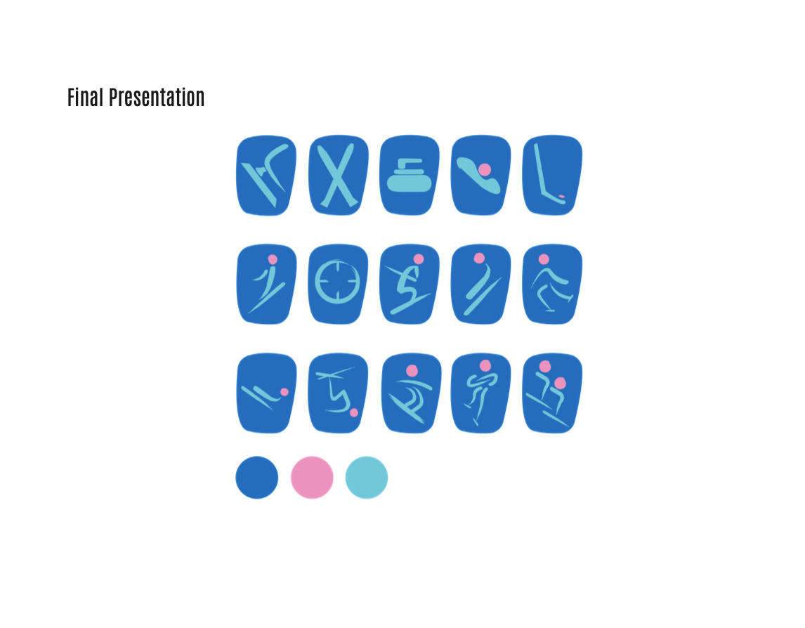
Early sketches around a runic logo, combining two Scandinavian runes to create a hidden meaning, inspired by the Bluetooth logo. Sketches for the mascot, a puffin, as well as the sport icons which will be used throughout the olympics presentation.
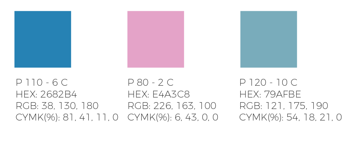
COLOR CHOICE
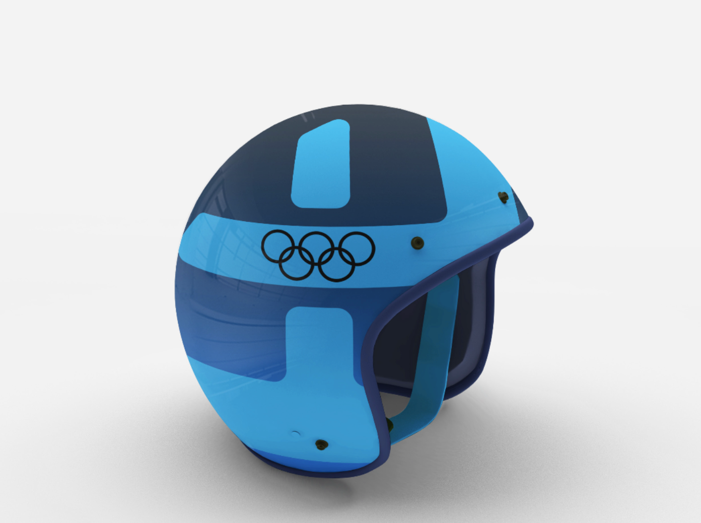
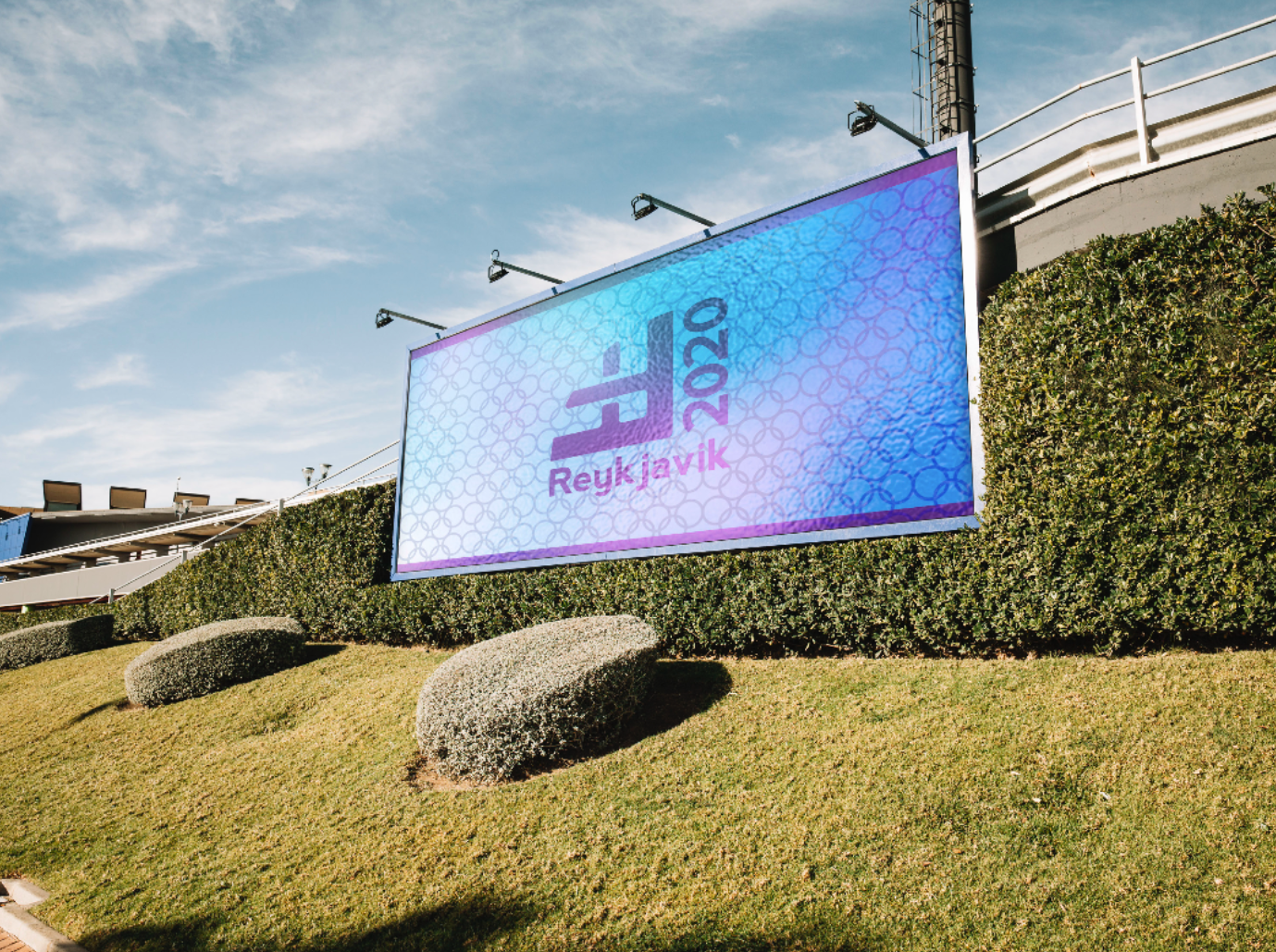
Inspired by the Northern Lights, these colors are present on that iridescent color spectrum, and match local colors. Iceland is known for having vibrantly painted houses, the brighter, more friendly the better. These three colors will serve for pictograms, mascot, and environmental placements.
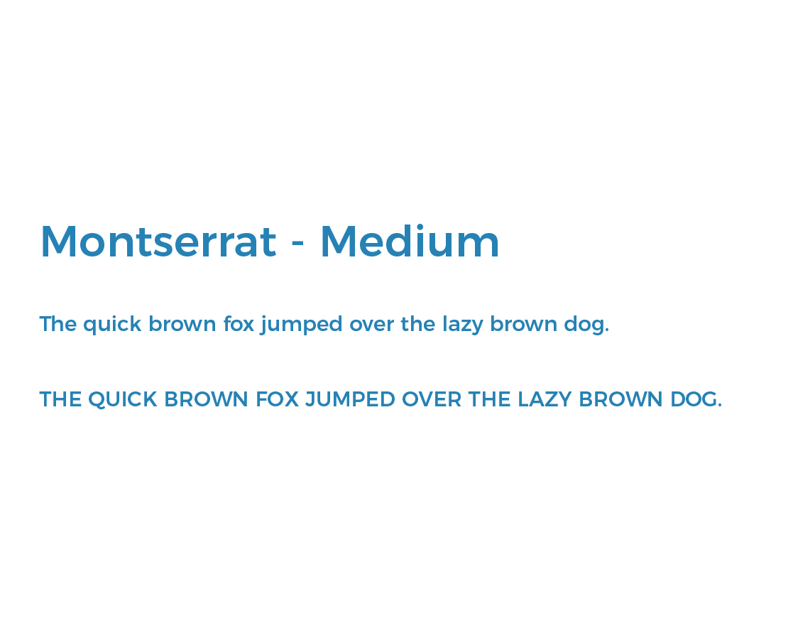
TYPOGRAPHY
Montserrat is sort of Helvetica’s quirky sibling, Iceland is sort of an odd country who embraces their cultural isolation, much like the island Montserrat is named after. This was the perfect choice, and only using one font weight makes it easier to organize hierarchy based on font size.
DIGITAL SKETCHES
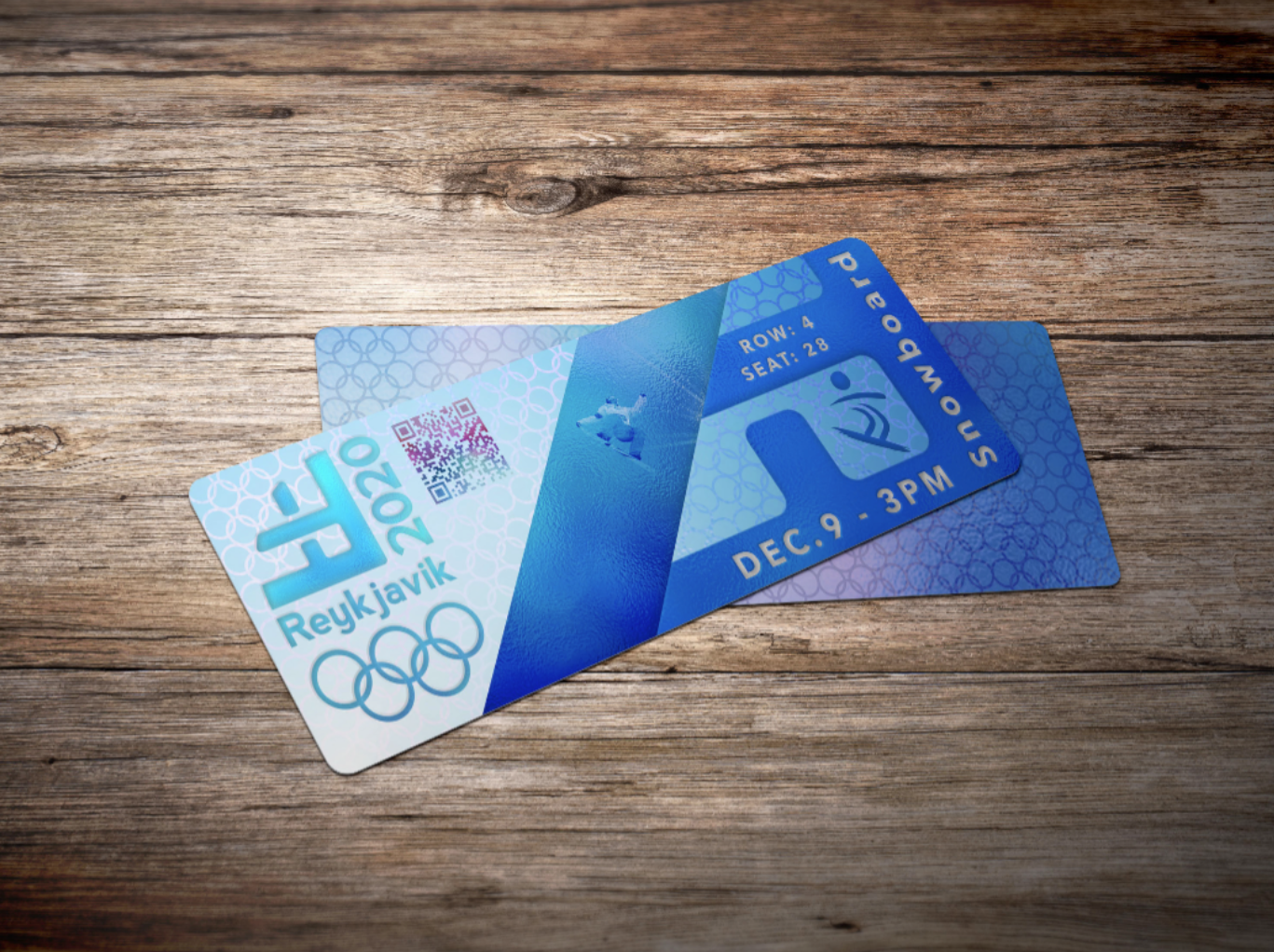
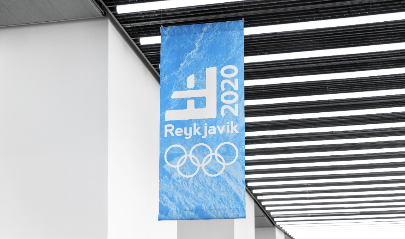
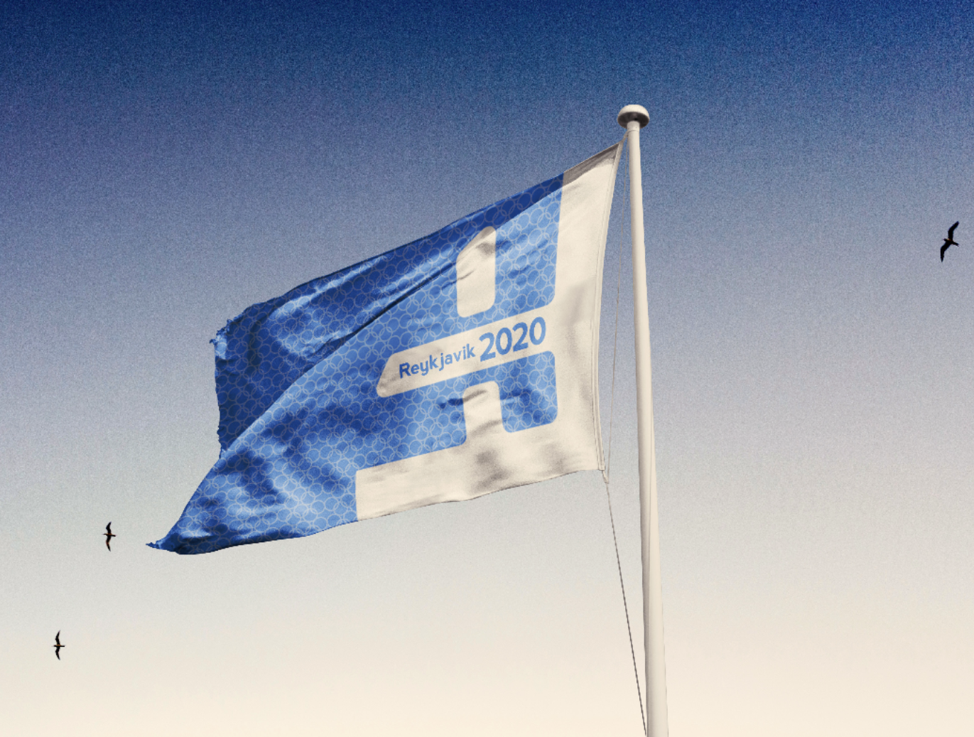
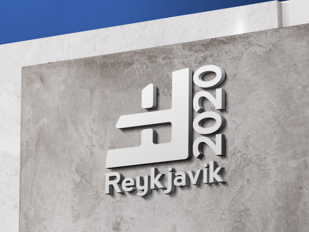
Redesigning something as important as the Olympic Games was a totally new challenge for me. Designing something that could be interpreted globally, while still appealing to the country became extremely important. Below is my final concept for the logo, combining two viking runes to say “Winter Homeland”.
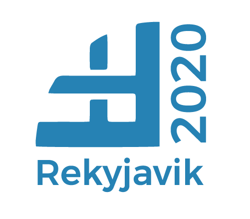
FINAL DESIGN
The goal of achieving a rune that reads "Winter Homeland" was successful, and the vertical type balances it nicely, and compliments the weight of the title of the city.
ENVIRONMENTAL CONTACT